Research and following wildfire developments in France, Spain and the UK has occupied a substantial amount of my time, so I think it's going to be quiet around here for a while as I focus on work.
I've been working on a literature review which has required filtering through 8,500 academic papers from Scopus, WoS and IEEE. In an effort to alleviate the mind-numbing boredom of the task, I created a custom control for my review process, as the title/abstract review filtering is necessarily manual. I have trust issues, and offloading to AI would also be an act of methodological indefensibility. But I'm now thinking about adding special fx to the buttons. It's the small things.

Mazowe is recovering well, and the vet is pleased with his progress. His energy levels have increased, and keeping him rested to aid recovery is, in a word, exhausting. Short quests to the kitchen to ensure the floor is surgically clean are permitted, not that we have much choice, as FOMO (Fear of Morsel Overlooked) is real. The image below is a contradiction, captured in a moment of calm, and yes, he has his own fan.

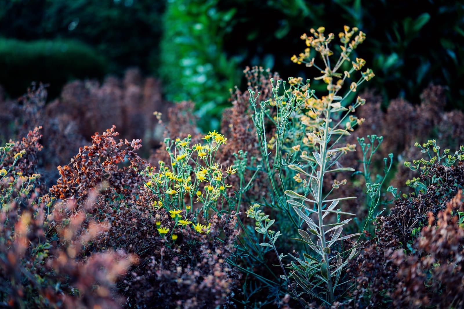
The UK is now formally under drought conditions, 50% of the country at least but that encompasses where we live. Four successive heatwaves are the culprit, and they have substantially impacted the garden. A hosepipe ban has been implemented in parallel, which is painful, as it requires manual watering by bucket or watering can to ensure the garden survives. Our garden is planted predominantly with resilient, drought-resistant plants but even they are showing signs of heat stress with new growth suppressed or scorched.
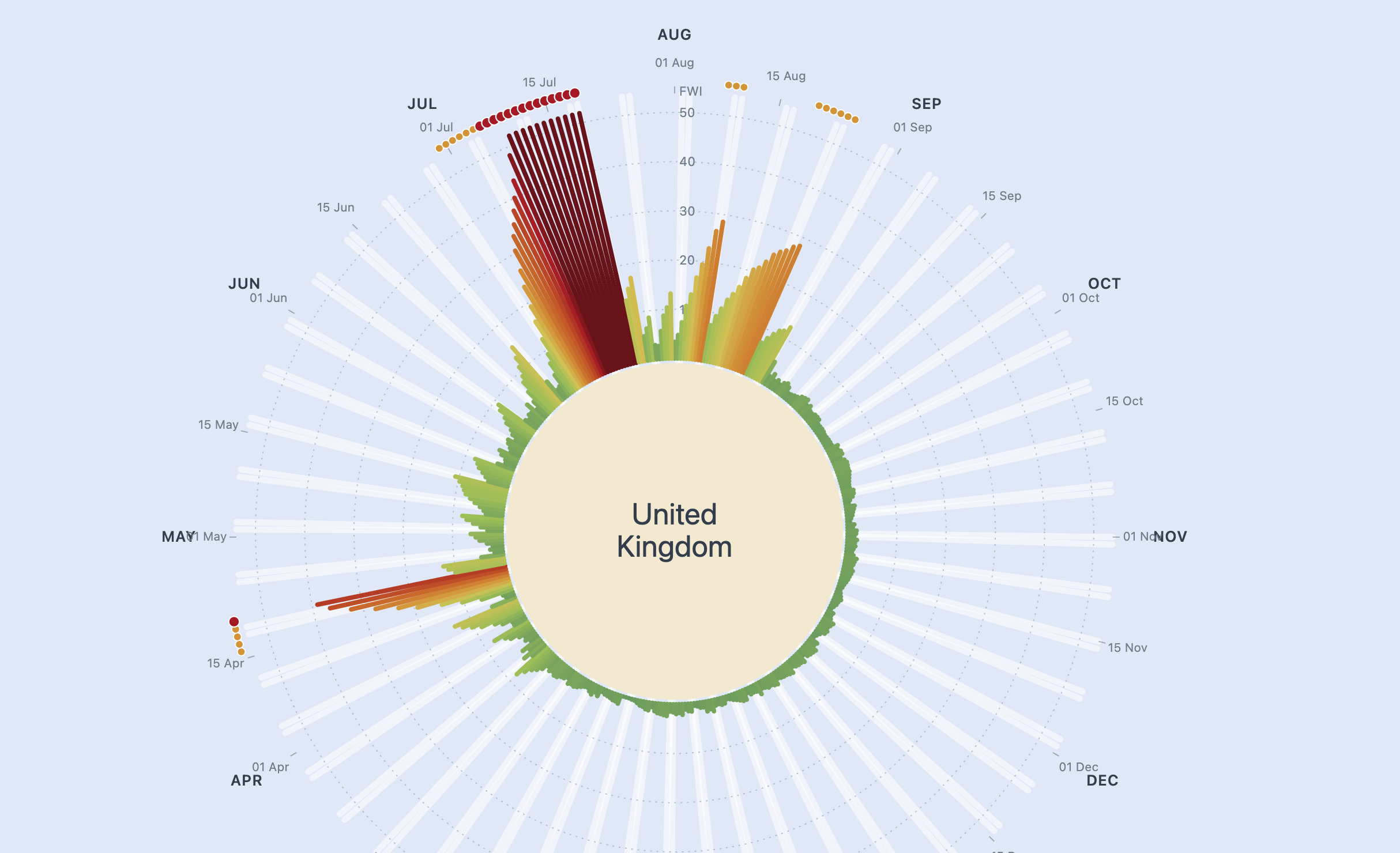
I have been experimenting with a data visualisation relating to wildfire - an amalgamation of Met Office warnings mapped to dates across a time interval, 12 months in the prototype. I wanted to show concentration risk and temporal change. If I can get a consistent data set, I can see it functioning a little like Professor Ed Hawkins' 'Show Your Stripes' except this will be warning-driven as indicator.
Data shown is an illustrative reconstruction of UK seasonality, but I will update it with current data and add a time series animation – perhaps a clock face sweep to introduce each successive year but likely more use is a fade that allows year on year comparison. Purely a proof of concept at this point.
Fire Weather Index (FWI) — the Canadian system the Met Office uses for England & Wales is employed as the basis of the design. Bar length and colour show the daily danger; the outer ring flags official-style warnings: amber = High, red = Very High / Exceptional. Faint white spokes mark weekends, when human ignitions typically rise.